William Nicholson at Pallant House Gallery
A morning out of the studio today, with a visit to Pallant House Gallery to see the William Nicholson Exhibition at Pallant House. It’s always a welcome shift to step away from the screen and spend time looking more closely at work in a different context.
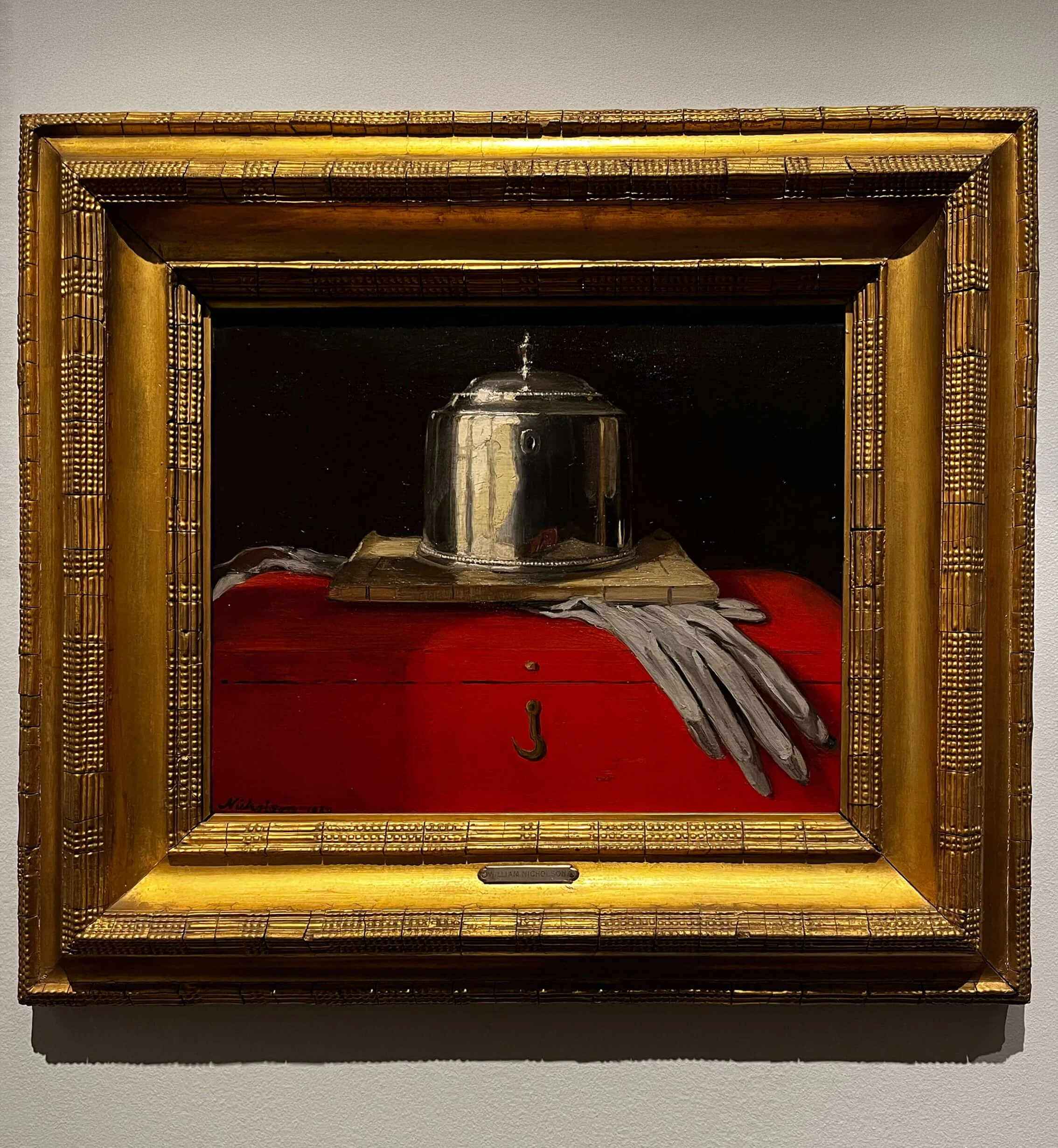
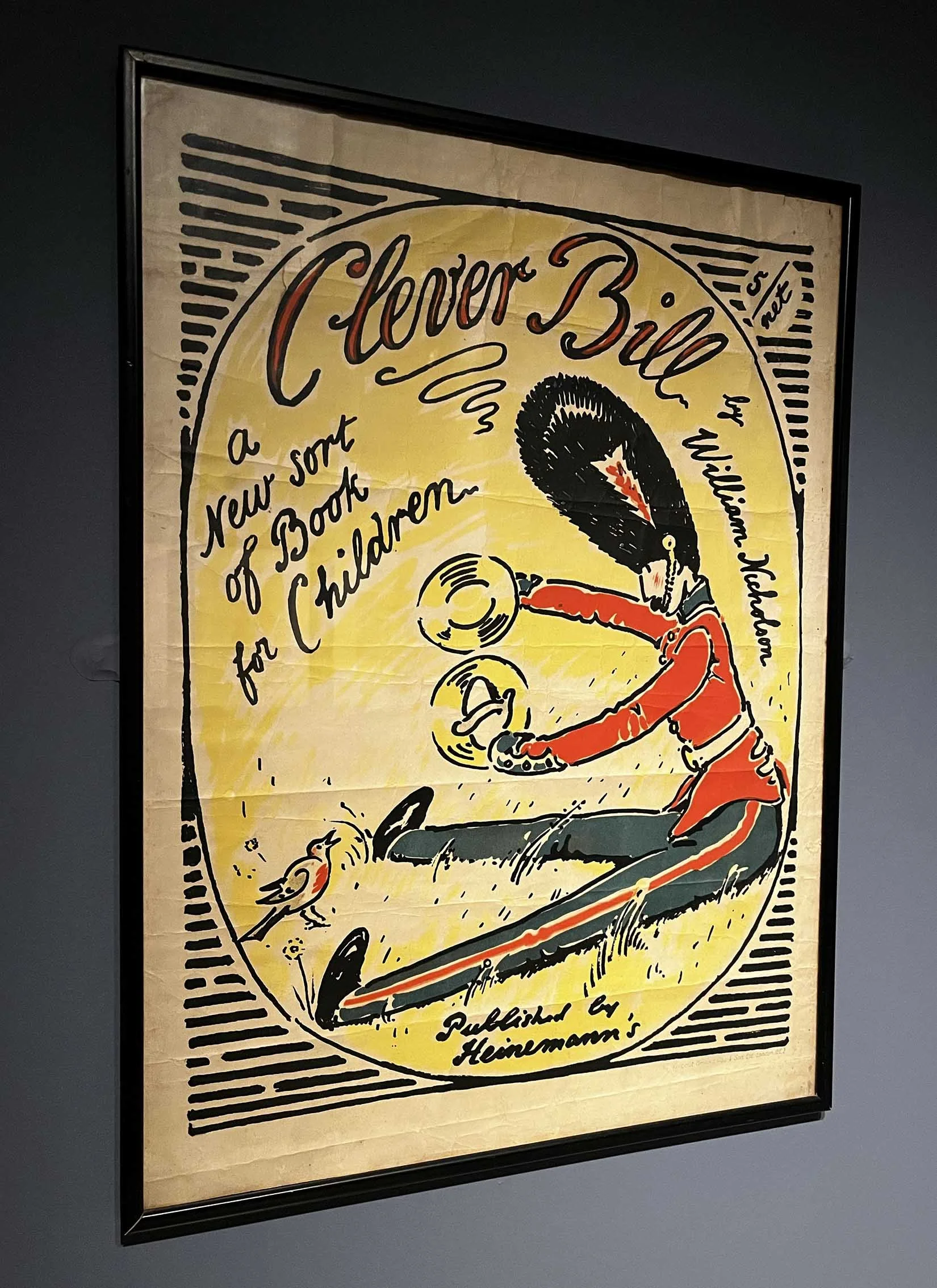
There was such a breadth of art on display, spanning multiple mediums and genres. From painting and illustration to design and print. Seeing this range together gives a fuller picture of Nicholson’s practice and the way his style translated across disciplines.
What I find particularly inspiring about William Nicholson is how clearly his graphic design background comes through in his work. There’s a confidence in the simplicity, forms are reduced without losing their presence, compositions feel carefully balanced, and colour is used with real restraint.
It’s a reminder that clarity doesn’t mean compromise. In fact, the opposite is often true. The ability to distil something down to its essentials, while still retaining character and impact, is something that translates directly into design today.
There’s also a quietness to much of Nicholson’s work that feels very considered. Nothing is overworked or over-explained. Each element has a purpose, and that sense of intention gives the work a lasting quality.
Spending time surrounded by art like this is always a useful reset. It encourages a slower pace of looking and thinking, which is something that’s easy to lose when working day-to-day across screens and deadlines.
Returning to the studio afterwards, there’s a renewed appreciation for simplicity, structure and restraint and a reminder that sometimes the most effective design decisions are the ones that take things away, rather than add more in.